Since its establishment in 2011, Foshan Baijinyi Precision Technology Co., Ltd. has grown steadily over the past 15 years. Adhering to the service philosophy of “delivering quality products and pursuing continuous improvement,” the company has achieved remarkable accomplishments. With the expansion of our business scale and the acceleration of our brand’s internationalization, the original logo has gradually become less aligned with the company’s evolving vision. Therefore, we have undertaken a comprehensive upgrade of our corporate identity.The new visual identity enhances brand recognition and reflects a stronger sense of modernity, aligning with the company’s strategic development and market expansion goals.Design ConceptThe new logo inherits the original visual DNA, retaining deep blue as the primary color to symbolize composure, stability, and advanced technology. Building upon this foundation, the letters “B,” “J,” and “Y” have been integrally reconstructed with sharper and more precise contours, establishing a visual tone of precision and reliability. This design symbolizes the company’s solid professional foundation in the field of precision technology.
The new corporate logo (LOGO) is officially adopted as of the date of this announcement.
Hereby announced.


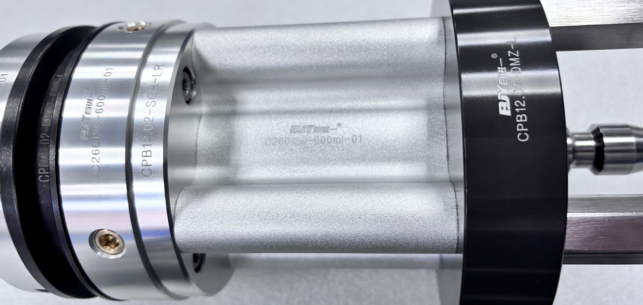
, established in 2011, is located in Hongweitai Industrial Park, Sanshui District, Foshan City, covering an area of over 4,000 square meters, only about an hour's drive from Guangzhou Baiyun Airport. \"BJY\" originates from the Chinese proverb \"To reach the top of a hundred-foot pole, one must strive for even greater heights,\" symbolizing our spirit of continuous innovation and progress. Our company is dedicated to the design and manufacture of PET liquid packaging molds, covering blow molding molds, preform molds, capping molds, and related accessories. Our products are suitable for blow molding machines, injection molding machines, capping machines, and rela")